Processed Data

|
Plant Height Trend Line Graph This graph provided us with a detailed look at the growing trend of plants, which grew in five different colors. We used the total height of all the plants in both containers one and two to display their growth. The growing patterns of Green and Yellow are very similar, from Day 0 to Day 7 they grew really fast but then followed a slight drop of growth because of some of the plants were dying. From Day 9 to Day 13, the plant continued to grow up. Overall, Green and Yellow demonstrated extremely similar patterns in terms of total height. The growth of White and Red plants showed a similar pattern as well, both having a significant growth sprout from Day 0 to Day 9. Later on they experienced a drop in growth and continued to grow in a reasonable level. Overall, White and Red showed a significant development rate compared with the others. The growth of Blue grew the most during the experiment, out growing all the other colors in height. All of the plants grew at a fast pace from Day 0 to Day 7, then slowed down as it continued on. |
|
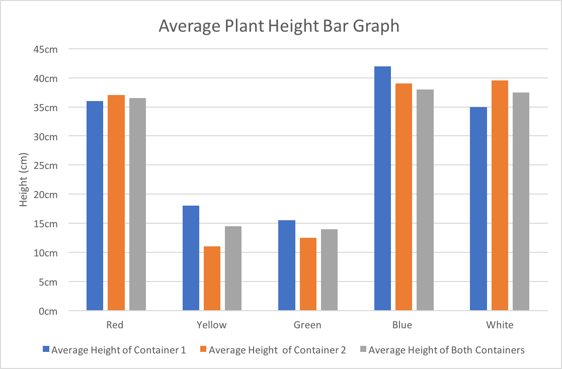
Average Plant Height Bar Graph This graph uses the average height of plants in Container 1, Container 2, and both containers in total to show the final result after 13 days under various color of lights. We can see that Yellow and Green are significantly shorter that the other three colors, Red, White, and Blue. The graph also compares the plants in container one and two, which proves that we have reduced the factor of luck by planting 8 seeds. |
|
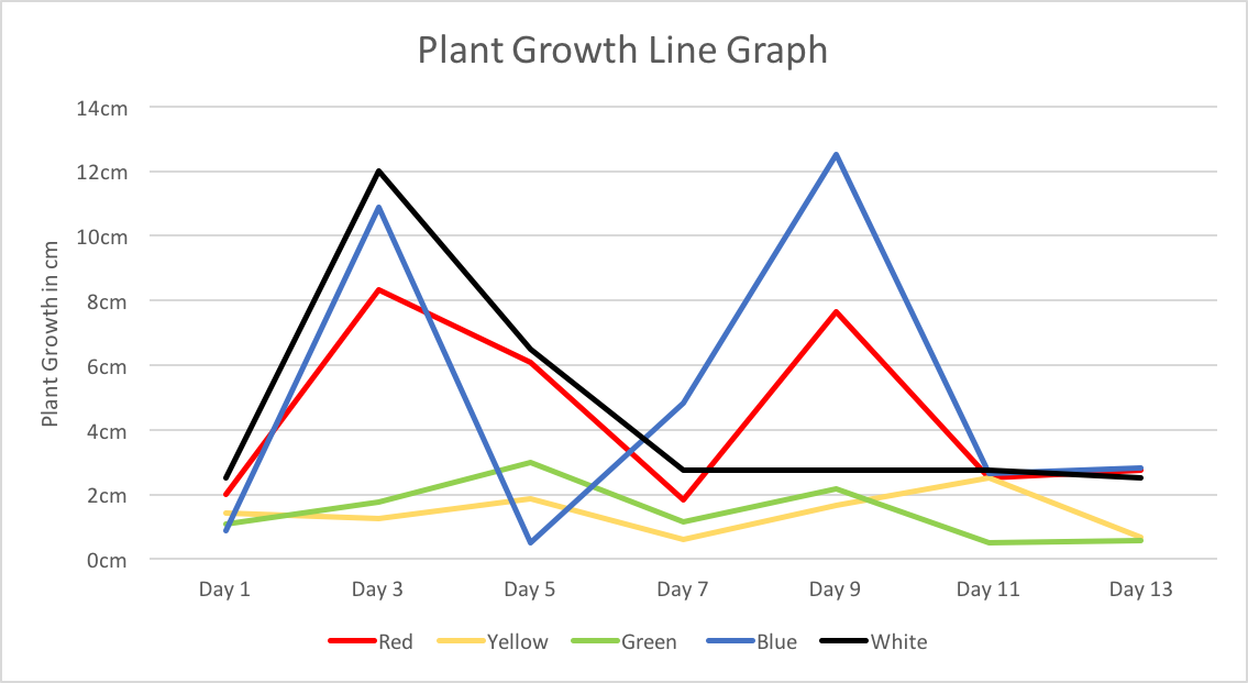
Plant Growth Line Graph This graph shows how much the plant grows every two days. By using the difference of the total plant height of the two days and dividing it by the number of plants, we got the growth rate for the two days. For Yellow and Green the growth rate is fairly consistent overall. Yellow’s average is about 1.43 cm per two days and Green’s average is around 1.46 cm per two days. For Blue, White, and Red, there was no specific pattern throughout the growth process. Blue had the highest average growth rate of them all with 5.01cm, White second with 4.54cm, and Red third with around 4.45cm. |

|
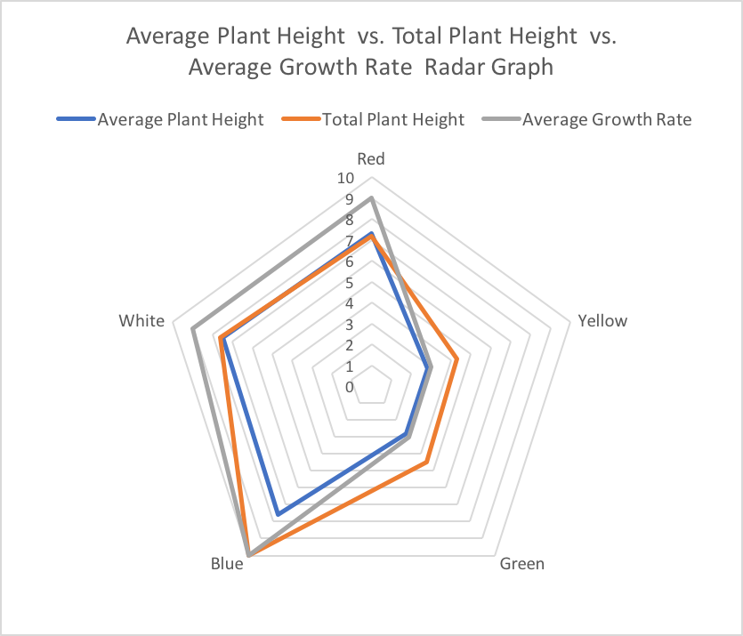
Average Plant Height vs. Total Plants' Height vs. Average Growth Rate Bar and Radar Graph This graph concludes all of the above into one by converting all data into ratios of ten. By doing so we can clearly see the result of our experiment. The bar graph gave us clear data to each of these elements and the radar graph displays a better visual representation of how much better did one color grew then the other. With that, we can conclude that blue and red is the most effective in growing plants. The combination of blue and red light with slightly more blue should be perfect for growing plants which in this case is the color ultraviolet. |
